Code
library(tidyverse)
library(scales)
library(leaflet)
library(leaflet.minicharts)
library(janitor)
library(plotly)
library(gganimate)
library(dygraphs)
options(scipen = 999)Stephen J Parton
20-10-2022
![]()
This analysis summarises Australian domestic flight volumes and on-time performance (OTP) issues by airline over time.
It has been prepared mainly to get more used to Quarto, and comprises:
Initial data load and preprocessing - not shown
Domestic Flight Analysis - This document
Global Flight Analysis - Next document
Forecasting - to come
Data is sourced from https://data.gov.au/ site, specific datasets used being:
Top routes
Industry Totals
On-Time-Performance - Domestic
(need to add notes/refs)
top_routes_prep_df <- read_rds("./artifacts/top_routes_prep_df.rds")
ind_totals_prep_df <- read_rds("./artifacts/ind_totals_prep_df.rds")
dom_cargo_prep_df  <- read_rds("./artifacts/dom_cargo_prep_df.rds")
otp_prep_df        <- read_rds("./artifacts/otp_prep_df.rds")
latest_date        <- max(top_routes_prep_df$date)
otp_prep_df <- otp_prep_df %>% 
  mutate(across(airline,str_replace,'QantasLink','Qantas')) %>% 
  mutate(across(airline,str_replace,"Virgin Australia - Atr/F100 Operations","Virgin Australia")) %>% 
  mutate(across(airline,str_replace,"Virgin Australia Regional Airlines","Virgin Australia"))Total monthly passenger numbers :
g <- ind_totals_prep_df %>% 
  #filter(year>2010) %>% 
  ggplot(aes(x=date,y=passenger_trips))+
  geom_line()+
  scale_y_continuous(labels=scales::comma)+
  scale_x_date(date_breaks = "2 year",date_labels = "%y")+
  labs(title = "Australian Domestic Flight History", x="Year", y = "Passenger Numbers (monthly)")+
  theme_bw()
ggplotly(g)Key “points of interest”:
1987 pilot strike
2000 Olympic Games
COVID!!!!
Seasonality and trend both also clearly show, at least until covid.
We can break this down by top 10 routes (only tracked 2-way):
## * Top routes ----
top_routes <- top_routes_prep_df %>% 
  group_by(route,date=max(date)) %>% 
  summarise(passenger_trips = sum(passenger_trips)) %>% 
  ungroup() %>%
  slice_max(passenger_trips, n=10) %>% 
  select(route) %>% 
  pull() %>% 
  as.character()
  
g1 <- top_routes_prep_df %>% 
  filter(route %in% top_routes) %>%
  mutate(route = factor(route,levels=top_routes)) %>% 
  ggplot(aes(date,passenger_trips,colour =route))+
  geom_line()+
  scale_y_continuous(labels=scales::comma)+
  scale_x_date(date_breaks = "2 year",date_labels = "%y")+
  scale_colour_discrete(name  ="Route - 2way")+
  labs(title = "Australian Domestic Flight History - Top10 (2-way) Routes", x="by Month", y = "Passenger Numbers (monthly)")+
  #theme_bw() +
  theme(legend.position="bottom")
ggplotly(g1)Following map shows all routes in 2019 (precovid), thickness of line representiing pax volumes for the year (in this case with a moving monthly timeline to show impact of covid - but does not really work that well). As width of line signifies volumes of passenger trips, Sydney-Melbourne route clearly has thickest line!
## * Routes Mapped - Leaflet ----
top_routes_short <- top_routes_prep_df %>%
  filter(year>2019) 
  # group_by(year,city1,city2,city1_lng,city1_lat,city2_lng,city2_lat) %>% 
  # summarise(passenger_trips = sum(passenger_trips))
  leaflet() %>% 
    addProviderTiles(providers$OpenTopoMap) %>% 
    addTiles() %>%
    #addProviderTiles(providers$Esri.WorldStreetMap) %>% 
  addFlows(
    top_routes_short$city1_lng, 
    top_routes_short$city1_lat, 
    top_routes_short$city2_lng, 
    top_routes_short$city2_lat,
    flow = top_routes_short$passenger_trips,
    time = top_routes_short$date,
    dir = 0,
    minThickness = .1,
    maxThickness = 5,
    popupOptions = list(closeOnClick = FALSE, autoClose = FALSE)
  )Performance Metric: OTP_issues_pct = (delayed arrivals + cancelled flights)/ Total Sectors Scheduled.
As this metric is based on arrival delays and canellations as a percentage of scheduled services, the higher the number, then the worse the performance!
otp_issues_all <- otp_prep_df %>% 
  filter(airline == "All Airlines") %>% 
  group_by(date) %>% 
  summarise(sectors_scheduled = sum(sectors_scheduled),
            arrivals_delayed = sum(arrivals_delayed),
            cancellations = sum(cancellations),
            otp_issues_num = sum(otp_issues_num)
            ) %>% 
  mutate(otp_issues_pct = (arrivals_delayed+cancellations)/sectors_scheduled)
g_opt <- otp_issues_all %>% 
  ggplot(aes(date,otp_issues_pct))+
  geom_line()+
  geom_smooth(method="loess")+
  scale_y_continuous(labels=scales::percent)+
  theme_bw()
ggplotly(g_opt)While the ‘loess’ smoother indicates a continual worsening of performance, most recent reporting perhaps indicates the airlines are starting to address OTP issues.
This graph just focuses on the main 3 domestic carriers.
otp_issues_airline <- otp_prep_df %>% 
  filter(airline %in% c("Jetstar","Qantas","Virgin Australia"),
         year > 2019
         ) %>%
  
  mutate(airline = str_to_title(airline)) %>% 
  group_by(date,airline) %>% 
  summarise(sectors_scheduled = sum(sectors_scheduled),
            arrivals_delayed  = sum(arrivals_delayed),
            cancellations     = sum(cancellations),
            otp_issues_num    = sum(otp_issues_num)
            ) %>% 
  mutate(arrivals_delayed_pct = arrivals_delayed/sectors_scheduled,
         cacellations_pct     = cancellations/sectors_scheduled,
         otp_issues_total_pct = (arrivals_delayed+cancellations)/sectors_scheduled ) %>% 
  select(date,airline,ends_with("pct")) %>% 
  pivot_longer(cols = ends_with("pct"), names_to = "otp_metric",values_to = "pct_issues")
g_otp_issues_airline <- otp_issues_airline %>% 
  ggplot(aes(date,pct_issues,colour = airline))+
  geom_line()+
  #geom_smooth(method="loess")+
  scale_x_date(date_breaks = "3 month",date_labels = "%m/%y")+
  scale_y_continuous(labels=scales::percent)+
  xlab("Month")+
  ylab("Pct of Monthly Scheduled Services") +
  theme_bw()+
  theme(legend.position =  "bottom")+
  facet_wrap(~otp_metric,ncol=1)
ggplotly(g_otp_issues_airline)Note:
cancellations in initial covid period
Upswing in OTP issues (mainly non-cancellations) in more recent days
Jetstar worst performer, although all 3 airlines guilty of worsening performance.
Signs of improvement in most recent reports.
To highlight the y-o-y changes:
year_select <- 2016
otp_issues_airline2 <- otp_prep_df %>% 
  filter(airline != "All Airlines",
         year > year_select
         ) %>%
  mutate(airline = str_to_title(airline)) %>% 
  group_by(year,airline) %>% 
  summarise(sectors_scheduled = sum(sectors_scheduled),
            arrivals_delayed = sum(arrivals_delayed),
            cancellations = sum(cancellations),
            otp_issues_num = sum(otp_issues_num)
            ) %>% 
  mutate(otp_issues_pct = (arrivals_delayed+cancellations)/sectors_scheduled ) %>% 
  mutate(airline = fct_reorder(airline,otp_issues_pct))
g_otp_issues_airline_2 <- otp_issues_airline2 %>% 
  filter(airline %in%c("Jetstar","Virgin Australia", "Qantas")) %>% 
  ggplot(aes(year,otp_issues_pct,fill = year))+
  geom_col()+
  geom_text(aes(label = percent(otp_issues_pct,accuracy = .1)),
            hjust = 1,
            colour = "white")+
  #coord_flip()+
  scale_y_continuous(labels=scales::percent)+
  #scale_x_discrete(breaks = 0)+
  ylab("OTP Issues/Scheduled Services")+
  xlab("")+
  labs(title="On-Time Performance Issues by Year",
       subtitle = "as pct of Scheduled Services")+
  theme_bw()+
  
  coord_flip()+
  facet_wrap(vars(airline),dir = "v")
g_otp_issues_airline_2
---
title: "Australian Domestic Flights"
author: "Stephen J Parton"
date: "2022-10-20"
categories: [code, analytics, flights, maps]
website:
  sidebar:
    style: "docked"
    search: true
format: 
  html: 
    theme: litera
    toc: true
    toc-title: Contents
    number-sections: true
    number-depth: 3
    code-fold: true
    code-summary: "Code"
    code-tools: true
execute: 
  echo: true
  warning: false
  error: false
  freeze: true
  cache: true
---
{width="215"}
## Introduction
This analysis summarises Australian domestic flight volumes and on-time performance (OTP) issues by airline over time.
It has been prepared mainly to get more used to Quarto, and comprises:
-   Initial data load and preprocessing - not shown
-   Domestic Flight Analysis - This document
-   Global Flight Analysis - Next document
-   Equivalent (draft) shiny app (on [shinyapps here](https://sjpanalytics.shinyapps.io/shiny_aust_flights/))
-   Forecasting - to come
```{r, load_packages}
library(tidyverse)
library(scales)
library(leaflet)
library(leaflet.minicharts)
library(janitor)
library(plotly)
library(gganimate)
library(dygraphs)
options(scipen = 999)
```
## Data Sources
Data is sourced from https://data.gov.au/ site, specific datasets used being:
-   Top routes
-   Industry Totals
-   On-Time-Performance - Domestic
(need to add notes/refs)
```{r, data_load}
top_routes_prep_df <- read_rds("./artifacts/top_routes_prep_df.rds")
ind_totals_prep_df <- read_rds("./artifacts/ind_totals_prep_df.rds")
dom_cargo_prep_df  <- read_rds("./artifacts/dom_cargo_prep_df.rds")
otp_prep_df        <- read_rds("./artifacts/otp_prep_df.rds")
latest_date        <- max(top_routes_prep_df$date)
otp_prep_df <- otp_prep_df %>% 
  mutate(across(airline,str_replace,'QantasLink','Qantas')) %>% 
  mutate(across(airline,str_replace,"Virgin Australia - Atr/F100 Operations","Virgin Australia")) %>% 
  mutate(across(airline,str_replace,"Virgin Australia Regional Airlines","Virgin Australia"))
```
## Exploratory Data Analysis
### All Major Routes - Total Monthly Pax
Total monthly passenger numbers :
```{r, total_pax}
g <- ind_totals_prep_df %>% 
  #filter(year>2010) %>% 
  ggplot(aes(x=date,y=passenger_trips))+
  geom_line()+
  scale_y_continuous(labels=scales::comma)+
  scale_x_date(date_breaks = "2 year",date_labels = "%y")+
  labs(title = "Australian Domestic Flight History", x="Year", y = "Passenger Numbers (monthly)")+
  theme_bw()
ggplotly(g)
```
Key "points of interest":
-   1987 pilot strike
-   2000 Olympic Games
-   COVID!!!!
Seasonality and trend both also clearly show, at least until covid.
We can break this down by top 10 routes (only tracked 2-way):
### Top 10 Routes - Monthly Pax by O/D City Pairs
```{r,top_routes}
## * Top routes ----
top_routes <- top_routes_prep_df %>% 
  group_by(route,date=max(date)) %>% 
  summarise(passenger_trips = sum(passenger_trips)) %>% 
  ungroup() %>%
  slice_max(passenger_trips, n=10) %>% 
  select(route) %>% 
  pull() %>% 
  as.character()
  
g1 <- top_routes_prep_df %>% 
  filter(route %in% top_routes) %>%
  mutate(route = factor(route,levels=top_routes)) %>% 
  ggplot(aes(date,passenger_trips,colour =route))+
  geom_line()+
  scale_y_continuous(labels=scales::comma)+
  scale_x_date(date_breaks = "2 year",date_labels = "%y")+
  scale_colour_discrete(name  ="Route - 2way")+
  labs(title = "Australian Domestic Flight History - Top10 (2-way) Routes", x="by Month", y = "Passenger Numbers (monthly)")+
  #theme_bw() +
  theme(legend.position="bottom")
ggplotly(g1)
```
### All Routes - Total Monthly Pax - Mapped
Following map shows all routes in 2019 (precovid), thickness of line representiing pax volumes for the year (in this case with a moving monthly timeline to show impact of covid - but does not really work that well). As width of line signifies volumes of passenger trips, Sydney-Melbourne route clearly has thickest line!
```{r, leaflet_mapped}
## * Routes Mapped - Leaflet ----
top_routes_short <- top_routes_prep_df %>%
  filter(year>2019) 
  # group_by(year,city1,city2,city1_lng,city1_lat,city2_lng,city2_lat) %>% 
  # summarise(passenger_trips = sum(passenger_trips))
  leaflet() %>% 
    addProviderTiles(providers$OpenTopoMap) %>% 
    addTiles() %>%
    #addProviderTiles(providers$Esri.WorldStreetMap) %>% 
  addFlows(
    top_routes_short$city1_lng, 
    top_routes_short$city1_lat, 
    top_routes_short$city2_lng, 
    top_routes_short$city2_lat,
    flow = top_routes_short$passenger_trips,
    time = top_routes_short$date,
    dir = 0,
    minThickness = .1,
    maxThickness = 5,
    popupOptions = list(closeOnClick = FALSE, autoClose = FALSE)
  )
```
### On Time Performance (OTP) - All Domestic Routes
Performance Metric: OTP_issues_pct = (delayed arrivals + cancelled flights)/ Total Sectors Scheduled.
As this metric is based on arrival delays and canellations as a percentage of scheduled services, the higher the number, then the worse the performance!
```{r, otp_total}
#| warnining: false
#| message: false
otp_issues_all <- otp_prep_df %>% 
  filter(airline == "All Airlines") %>% 
  group_by(date) %>% 
  summarise(sectors_scheduled = sum(sectors_scheduled),
            arrivals_delayed = sum(arrivals_delayed),
            cancellations = sum(cancellations),
            otp_issues_num = sum(otp_issues_num)
            ) %>% 
  mutate(otp_issues_pct = (arrivals_delayed+cancellations)/sectors_scheduled)
g_opt <- otp_issues_all %>% 
  ggplot(aes(date,otp_issues_pct))+
  geom_line()+
  geom_smooth(method="loess")+
  scale_y_continuous(labels=scales::percent)+
  theme_bw()
ggplotly(g_opt)
```
While the 'loess' smoother indicates a continual worsening of performance, most recent reporting perhaps indicates the airlines are starting to address OTP issues.
### OTP - By Airline over Time
This graph just focuses on the main 3 domestic carriers.
```{r, otp_airline}
otp_issues_airline <- otp_prep_df %>% 
  filter(airline %in% c("Jetstar","Qantas","Virgin Australia"),
         year > 2019
         ) %>%
  
  mutate(airline = str_to_title(airline)) %>% 
  group_by(date,airline) %>% 
  summarise(sectors_scheduled = sum(sectors_scheduled),
            arrivals_delayed  = sum(arrivals_delayed),
            cancellations     = sum(cancellations),
            otp_issues_num    = sum(otp_issues_num)
            ) %>% 
  mutate(arrivals_delayed_pct = arrivals_delayed/sectors_scheduled,
         cacellations_pct     = cancellations/sectors_scheduled,
         otp_issues_total_pct = (arrivals_delayed+cancellations)/sectors_scheduled ) %>% 
  select(date,airline,ends_with("pct")) %>% 
  pivot_longer(cols = ends_with("pct"), names_to = "otp_metric",values_to = "pct_issues")
g_otp_issues_airline <- otp_issues_airline %>% 
  ggplot(aes(date,pct_issues,colour = airline))+
  geom_line()+
  #geom_smooth(method="loess")+
  scale_x_date(date_breaks = "3 month",date_labels = "%m/%y")+
  scale_y_continuous(labels=scales::percent)+
  xlab("Month")+
  ylab("Pct of Monthly Scheduled Services") +
  theme_bw()+
  theme(legend.position =  "bottom")+
  facet_wrap(~otp_metric,ncol=1)
ggplotly(g_otp_issues_airline)
```
Note:
-   cancellations in initial covid period
-   Upswing in OTP issues (mainly non-cancellations) in more recent days
-   Jetstar worst performer, although all 3 airlines guilty of worsening performance.
-   Signs of improvement in most recent reports.
To highlight the y-o-y changes:
```{r, fig.height= 8}
year_select <- 2016
otp_issues_airline2 <- otp_prep_df %>% 
  filter(airline != "All Airlines",
         year > year_select
         ) %>%
  mutate(airline = str_to_title(airline)) %>% 
  group_by(year,airline) %>% 
  summarise(sectors_scheduled = sum(sectors_scheduled),
            arrivals_delayed = sum(arrivals_delayed),
            cancellations = sum(cancellations),
            otp_issues_num = sum(otp_issues_num)
            ) %>% 
  mutate(otp_issues_pct = (arrivals_delayed+cancellations)/sectors_scheduled ) %>% 
  mutate(airline = fct_reorder(airline,otp_issues_pct))
g_otp_issues_airline_2 <- otp_issues_airline2 %>% 
  filter(airline %in%c("Jetstar","Virgin Australia", "Qantas")) %>% 
  ggplot(aes(year,otp_issues_pct,fill = year))+
  geom_col()+
  geom_text(aes(label = percent(otp_issues_pct,accuracy = .1)),
            hjust = 1,
            colour = "white")+
  #coord_flip()+
  scale_y_continuous(labels=scales::percent)+
  #scale_x_discrete(breaks = 0)+
  ylab("OTP Issues/Scheduled Services")+
  xlab("")+
  labs(title="On-Time Performance Issues by Year",
       subtitle = "as pct of Scheduled Services")+
  theme_bw()+
  
  coord_flip()+
  facet_wrap(vars(airline),dir = "v")
g_otp_issues_airline_2
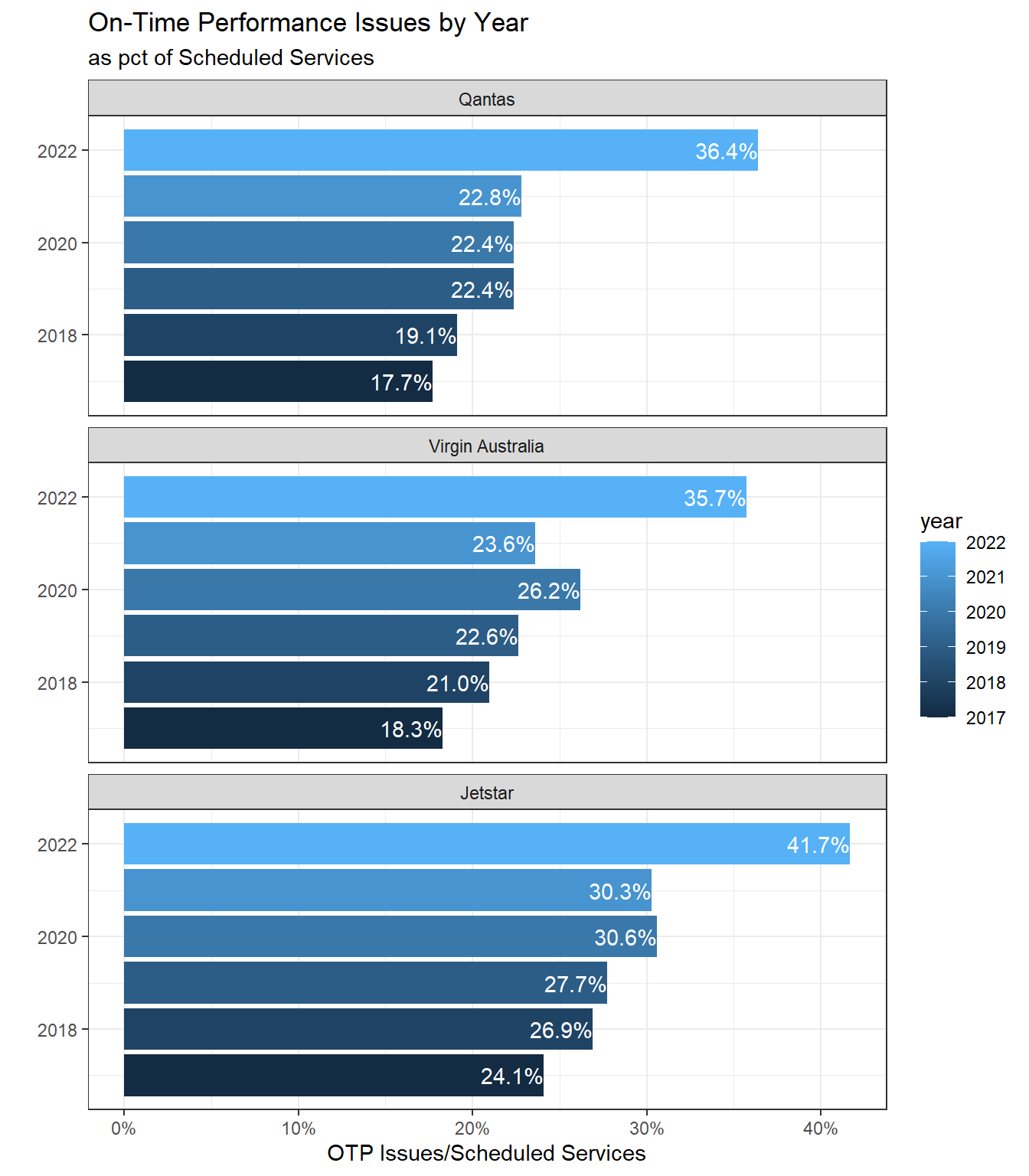
#ggplotly(g_otp_issues_airline_2)
```