Code
#| echo: false
#| message: false
#| warning: false

library(tidyverse)
library(scales)

library(maps)
library(geosphere)

library(janitor)
library(plotly)
library(gganimate)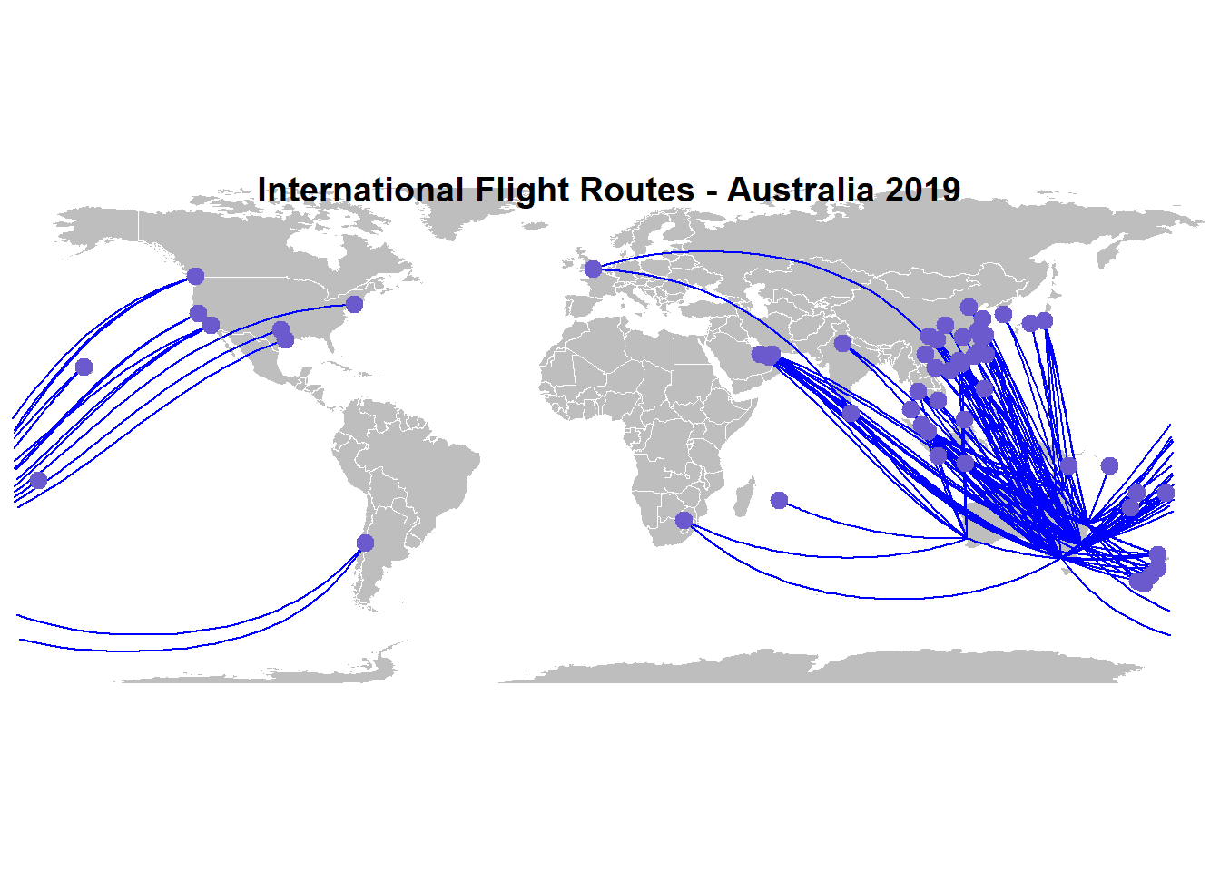
This analysis summarises Australian international flight volumes over time.
It has been prepared mainly to get more used to Quarto, and comprises:
Initial data load and preprocessing - not shown
Domestic Flight Analysis - previous post
Global Flight Analysis - this document
Forecasting - to come
This is a pretty brief look - might try it in Shiny where it will probably come together better. The biggest challenge was the great circle mapping, the solution to which was pretty much right in front of me on ‘the R Graph Gallery’…
Load packages:
#| echo: false
#| message: false
#| warning: false
library(tidyverse)
library(scales)
library(maps)
library(geosphere)
library(janitor)
library(plotly)
library(gganimate)Load pre-processed data:
#| echo: false

intl_flights_seats_prep_df <- read_rds("./artifacts/intl_flights_seats_prep_df.rds")
intl_flights_city_pairs_prep_df <- read_rds("./artifacts/intl_flights_city_pairs_prep_df.rds")
intl_country_of_port_prep_df <- read_rds("./artifacts/intl_country_of_port_prep_df.rds")Total monthly passenger numbers , which shows the cliff it went off, but also some solid signs of rebound:
## * Industry Volumes by Time ----
city_pair_totals <- intl_flights_city_pairs_prep_df %>%
  group_by(date) %>%
  summarise(passengers_total =sum(passengers_total))

g <- city_pair_totals %>%
  #filter(year>2010) %>%
  ggplot(aes(x=date,y=passengers_total))+
  geom_line()+
  scale_y_continuous(labels=scales::comma)+
  scale_x_date(date_breaks = "2 year",date_labels = "%y")+
  labs(title = "Australian Global Flight History", x="Year", y = "Passenger Numbers (monthly)")+
  theme_bw()
ggplotly(g)Yep, that will hurt:
top_totals <- intl_flights_city_pairs_prep_df %>%
  filter(year ==2019) %>%
  group_by(year, route) %>%
  summarise(passengers_total =sum(passengers_total)) %>%
  ungroup() %>%
  slice_max(passengers_total, n=20) %>%
  select(route) %>%
  pull() %>%
  as.character()

g1 <- intl_flights_city_pairs_prep_df %>%
  filter(route %in% top_totals,year > 2014) %>%
  mutate(route = factor(route,levels=top_totals)) %>%
  ggplot(aes(date,passengers_total,colour =route))+
  geom_line()+
  scale_y_continuous(labels=scales::comma)+
  scale_x_date(date_breaks = "2 year",date_labels = "%y")+
  scale_colour_discrete(name  ="Route - 2way")+
  labs(title = "Australian International Flight History - Top (2-way) Routes", x="by Month", y = "Passenger Numbers (monthly)")+
  theme_bw()

ggplotly(g1)Which tells the same story all over again!
destination_df <- intl_flights_city_pairs_prep_df %>%
  group_by(intl_city_country,international_city,year) %>%
  summarise(
    passengers_total = sum(passengers_total),
    freight_total_tonnes = sum(freight_total_tonnes),
    mail_total_tonnes = sum(mail_total_tonnes)
    ) %>%
  ungroup()

top_dest_unique <- destination_df %>%
  group_by(international_city) %>%
  summarise(passengers_total = sum(passengers_total)) %>%
  ungroup() %>%
  slice_max(passengers_total, n=10) %>%
  select(international_city) %>%
  unique() %>%
  pull() %>%
  as.character()


g2 <- destination_df %>%
  filter(international_city %in% top_dest_unique ,year > 2016) %>%
  ggplot(aes(international_city,passengers_total))+
  geom_col()+
  scale_y_continuous(labels=scales::comma)+
  scale_colour_discrete(name  ="Route - 2way")+
  labs(title = "Australian International Flight History - Top Destinations", x="", y = "Passenger Numbers pa")+
  theme_bw() +
  facet_wrap(~year,ncol = 1,dir = "v",scales = "free_y") +
  coord_flip()

g2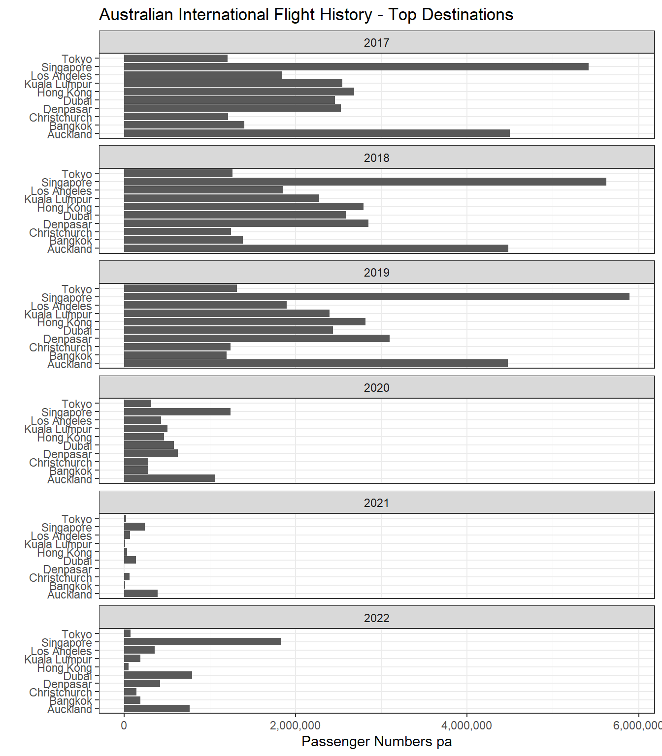
Using 2019, just because it is pre-covid. Could use later years and will in a more dynamic environment.
Setting up required code:
top_routes <- intl_flights_city_pairs_prep_df %>%
  filter(year ==2019) %>%
  group_by(route) %>%
  summarise(passengers_total = sum(passengers_total)) %>%
  ungroup() %>%
  slice_max(passengers_total, n=150) %>%
  select(route) %>%
  pull() %>%
  as.character()

routes <- intl_flights_city_pairs_prep_df %>%
  filter(route %in% top_routes) %>%
  select(route,australian_city, international_city,
         aust_city_lat,aust_city_lng,
         intl_city_lat,intl_city_lng) %>%
  unique()
And the resulting map:
# A function to plot routes
plot_routes=function( dep_lon, dep_lat, arr_lon, arr_lat, ...){
  inter <- gcIntermediate(c(dep_lon, dep_lat), c(arr_lon, arr_lat), n=50, addStartEnd=TRUE, breakAtDateLine=F)
  inter=data.frame(inter)
  diff_of_lon=abs(dep_lon) + abs(arr_lon)
  if(diff_of_lon > 180){
    lines(subset(inter, lon>=0), ...)
    lines(subset(inter, lon<0), ...)
  }else{
    lines(inter, ...)
  }
}

# background map
par(mar=c(0,0,0,0))
map('world',col="gray", fill=TRUE, bg="white",
    lwd=0.05,border=0, mar=rep(0,4),ylim=c(-75,75) )
title("International Flight Routes - Australia 2019")

# add all selected routes:
for(i in 1:nrow(routes)){
  plot_routes(routes$aust_city_lng[i],
              routes$aust_city_lat[i],
              routes$intl_city_lng[i],
              routes$intl_city_lat[i],
              col="blue", lwd=1)
}

# add points and names of cities
points(x=routes$intl_city_lng,
       y=routes$intl_city_lat, col="slateblue", cex=2, pch=20)
The above map is a bit(!) overloaded, because I left all routes in (to pick up London, New York etc). We can play with that in a more dynamic environment, probably Shiny (or even Power Bi)
As mentioned, the great circle mapping was a bit of a pain to do, but actually quite simple once you find the correct approach. I will improve this as time permits!